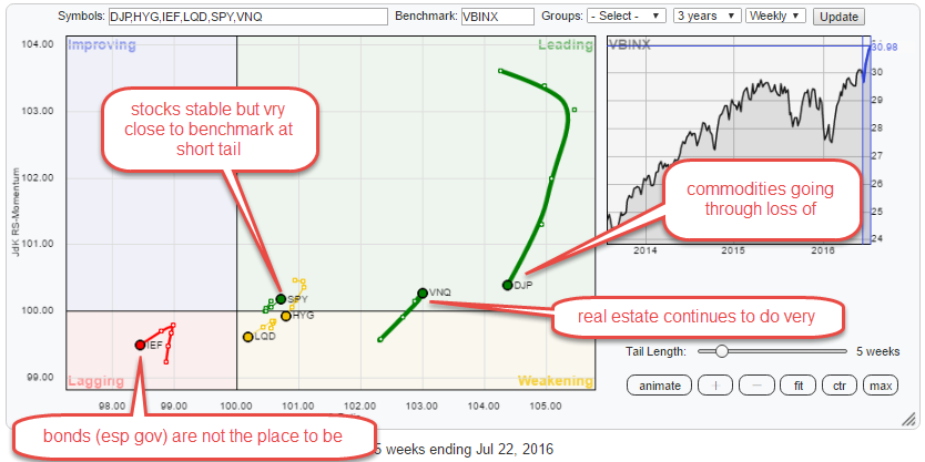
The Relative Rotation Graph below shows the rotation for various asset classes (through ETFs) against the Vanguard Balanced Index fund (VBINX) on a weekly basis.
The picture is pretty conclusive for some asset classes but less so for others. Zooming in on the daily time-frame, usually, helps to add a bit more info and color to the weekly reading of the RRG.
The RRG of international stock markets relative to the FTSE all world index also paints an interesting picture for US stocks.